WellNest
WellNest is a conceptualized mobile application built for Wilfrid Laurier Wellness Centre.
Following Wilfrid Laurier's design guide, I designed with my team an application that acts as a hub, educating students on services and facilitating appointment scheduling.
This project was completed for UX103: UX Strategy.
Methods
User Research Prototyping Usability Testing UI Design Info Architecture
Timeline
Jan - April 2023
Role
UI Designer
UX Reseracher
Lead Contact

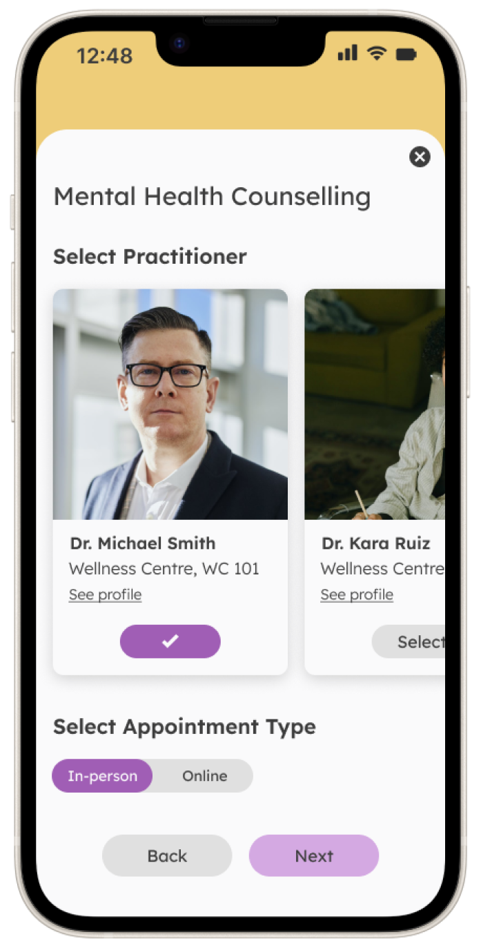
01. The Problem - Why are appointments only over the phone?
How might we redesign the Laurier Wellness Centre appointment booking process so students who experience phone anxiety or encounter busy phone lines can schedule appointments easily and reliably?
Double Diamond Design Framework
Deliver
Discover
Define
Develop
02. Discovering the root causes of the problem
We started the design process with preliminary research, including interviews and surveys with students and staff. We gained many insights into the booking process's frustrations and positive aspects and discovered key Themes and Behaviours.
We made an affinity diagram from the findings from the user & staff interviews and surveys. This helped to visualize and sort the data from the interviews.
Interviews with the staff and users found that the common problem of taking calls over the phone was due to old systems and outdated technology in use by the Wellness centre. The staff noted that the appointment-taking software was slow and limited in its operation.
The last main finding - Users sought a comfortable and already known process in a potential booking application.
The users felt motivated when being presented with the potential process from other popular booking applications while also exploring the added features of offering added information the Wellness Centre offered.

We then created three personas to visualize the key takeaways for each user group


Describe your image
The Double Diamond Design Framework
Deliver
Discover
Define
Develop
03. Defining the why and the pain points to target
01
Phone Anxiety
02
Unaware of services offered
03
Staff struggle to keep up
Developed from the 5 whys matrix
01. Students showcased anxiety over making phone calls to the Wellness Centre
02. Students such as the Confused Newbie were unaware of what the Wellness Centre offered
03. Staff struggled to balance their work with the constant ringing and speed of the outdated booking system.
The Double Diamond Design Framework
Deliver
Discover
Define
Develop
At the start of the development phase, we focused on ideation and how we wanted to tackle all pain points and connect education to wellness.
To start the brainstorming and ideation of how to mix education and wellness we employed the use of crazy 8's wireframing and sketching. The brainstorming helped us to derive these wireframes which then were updated and changed to colour options so that we can start testing the wireframes and information offered on the application.


04. Usability Testing the low-fidelity wireframes
From Usability testing of the wireframes, we developed multiple changes while also focusing on what content needed to be seen first.
The problem Areas we found from the usability test were
01. Testees were not able to find the specific information asked for from the usability tests.
02. During usability tests, testees were confused by the labels on the categories.
03. Testees felt some pages and categories were "not needed" or "to fill space."
04. Testees did not understand the order in which elements were placed and stated the application "over-delivers information."

Following the usability testing, we cleared up needed sections of the application and eliminated filler information found by the testees.
The changes made following the main pain points found are:
01. "Upcoming" on the home page was moved since users felt this section was unnecessary
03. "Meet the team" was given its own section as it was found to not align with any other section.
04. The "Events" section was removed from home and moved to its page as users found it gave the homepage an excessive amount of information
05. "Home" now has a Call to Action button to promote speed of use for seasoned users.
06. "Appointments" and "Services" were combined and moved to "Bookings" due to confusion of labels and similar functions.
05. Usability Testing Round 2
In round 2 of the Usability testing of the Medium Fidelity, we found that the medium fidelity fixed most of the issues in round 1 of usability testing.
30
Seconds less on each task
89
Percent success rate of task
2
Average number of errors per task
Top findings from usability tests
The second round of usability testing found that the task to find insurance information was the worst out of the nine tasks.

Added Insurance as its section in the profile section to remedy the issue of task failure
The Double Diamond Design Framework
Deliver
Discover
Define
Develop
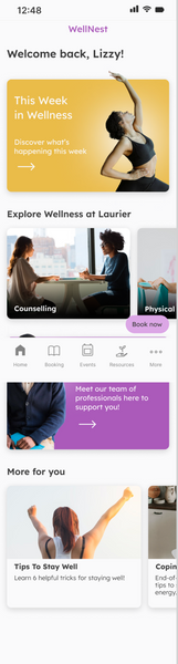
06. Welcome WellNest
Laurier's Digital Wellness App
.png)

Book appointments with a single touch, anytime
 |  |  |
|---|
See upcoming events at a single glance